Posted by Janne Cederberg on Jan. 28, 2016
Categories: Programming
Reading time: approx. 1 minute(s)
Categories: Programming
Reading time: approx. 1 minute(s)
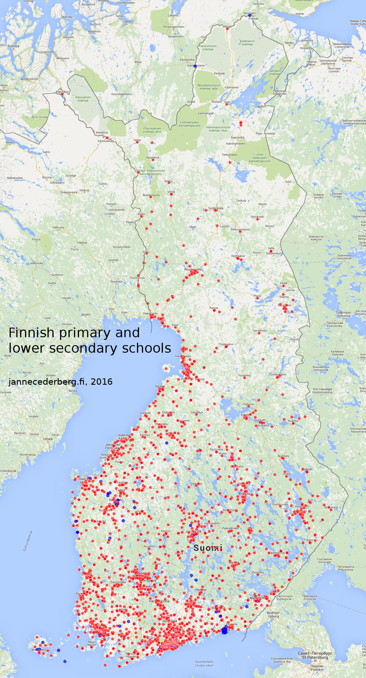
I utilized Google Maps, Python and standard webdesign frontend technologies to plot Finnish primary and lower secondary schools (grades 1-9) on a map:
Edit 16.2.2016: The 82 blue dots represent schools that only had postal addresses available in the source data and were initially missing; it seems 34 schools are still missing from the data for a reason I didn’t investigate.
What partially surprised me was how many schools there are in the archipelago region between Turku and the Åland Islans (bottom-left / south-western part of the map).
The map acts sort of as a population density indicator as well.
What do you think? Please leave your comments/questions below :)
comments powered by Disqus